For the architects at Mode:lina every project starts with a research phase. During this period, they focus on the client and all his custom needs and ideas. Their goal is always to create spaces and project that last and that their clients can cherish for years to come.
Mode:lina Architekci is a company founded in 2009 and with every project it became more and more popular, currently having around 100 publications in magazines all over the world. One of their most recent project is the office designed for Opera Software in Poland.
 View in gallery
 View in gallery
Completed in 2016, the office interior is defined by a unique combination of history, geometry and local charm. The office benefits from a prestigious location right next to the Opera House in the city of Wroclaw. It occupies an area of 400 square meters divided into various functional zones.
 View in gallery
 View in gallery
 View in gallery
The clients wanted the office to distance itself from the typical corporate workspaces and to be more welcoming and friendly in this sense. The architects drew inspiration from their surroundings and the beautiful architecture that defines the city.
 View in gallery
 View in gallery
Images of Wroclaw pictured as “the city of one hundred bridges” became the main theme that shaped the interior. These images are displayed next to the elements that they inspired so the reference is more clear and comparisons can be made. This way the designers also found a suitable way to decorate some of the walls in the office.
 View in gallery
 View in gallery

Although the interior design is mostly abstract, there are clear references to architectural icons found in the city. Some of these include the Market Hall, the Central Railway Station and the Sczytnicki Park. The Norwegian client company wanted this office to be infused with local flavor so everyone can feel comfortable and welcomed.
 View in gallery
 View in gallery
 View in gallery
The story of this whole project started with an e-mail from the client company stating that they wanted “the best office in the world”. This was no easy task but the architects were prepared to make it happen. So let’s see what their design strategy was for each type of space.
 View in gallery
 View in gallery
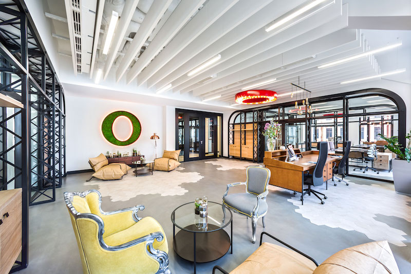
The common areas are bright and spacious, without a lot of furniture that could make them look cramped or cluttered. Comfortable chairs, floor sofas and chic coffee tables are spread throughout the office.
 View in gallery
 View in gallery
A nice detail that links the various spaces is the design of the floors which is a combination of geometric tile sections and wood or other materials. As far as furniture goes, a combination of modern, vintage and industrial defines the décor, creating an eclectic environment.
 View in gallery
 View in gallery
Spaces such as the kitchen or the dining zone are meant to feel homey and inviting but also elegant with a subtle sense of formality. The main colors are mostly neutral, based on earthy shades, natural wood and stone.
 View in gallery
 View in gallery
 View in gallery
Each space has its own set of bright and vibrant accent colors. These range from vivid reds to fresh greens and yellows and they come in a lot of different forms such as lighting fixtures, wall paint, chairs or wall décor.
 View in gallery
 View in gallery
The work areas are simple and professional but not without warmth and charm. The desks are custom designed to be user-friendly and aesthetically pleasing and in tone with the rest of the décor. Each employee gets to add a personal touch to their workspace with little things like potted plants or framed photos.
 View in gallery
 View in gallery
 View in gallery
The arched windows of the building and the high ceilings add a little bit of drama and sophistication to the spaces, contrasting with the interior design in terms of style but also establishing a unique connection.
 View in gallery
 View in gallery
The meeting rooms are the spaces where the designers were most creative. These areas are defined by IT and computer-inspired decors. One room, for instance, has rows of 1s and 0s on the walls and the table is also designed with a custom inlay that reflects the same pattern.
 View in gallery
 View in gallery
In another meeting room the designers used more than 1000 old floppy disks to cover portions of the walls and the table. The result is a geeky and very interesting display that reflects the company’s character.
 View in gallery
 View in gallery
 View in gallery

One of the spaces was decorated using more than 200 old keyboards. A wonderful way to repurpose old office supplies and to create something unique that everyone can cherish and feel inspired by.
 View in gallery
 View in gallery
 View in gallery
 View in gallery
There’s also a really interesting room which has the walls painted green and decorated with custom pipe lighting systems. It’s a really cool sight meant to encourage new ideas and to offer inspiration.
 View in gallery
 View in gallery


