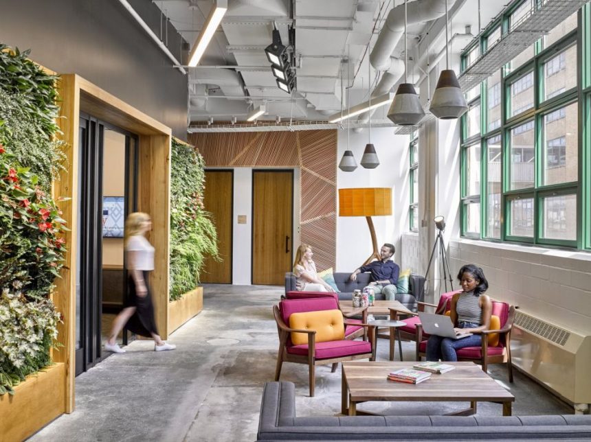
With Greenery being color of the year and everything, we’re feeling pretty inspired to bring some freshness into our lives and to welcome nature into our homes and workspaces. So we did some research and we found out that green walls are actually pretty popular in offices. A lot of architects and designers choose to integrate this feature in their projects and for good reason. Green walls can completely transform spaces, make them feel fresh and inviting and they also help with the productivity at the office.
Ever wondered what’s behind a website or a product that you frequently use? Who created it and how did the creative process evolve? Sometimes it’s interesting to dig a little deeper. For instance, this is the office of the company behind the website Money.co.uk. The space was designed by Interaction and it looks very cheerful, fun and enjoyable.
 View in gallery
Curious to know where all the great ideas are born and revised before Etsy releases them to the whole world? Check out their office in Brooklyn, NYC. It was designed by Gensier and it’s a colorful, fresh and very cozy space with green walls, ceiling decorations and funky furniture.
 View in gallery
A lot of companies use Slack every day but few actually know anything about the company behind the software. The Slack offices in Vancouver, British Columbia reveal a friendly and welcoming environment with exposed brick walls, cool lighting, modern decor accents and this wonderful green wall that contrasts with everything else in the building. The interior design is the work of Leckie Studio.
 View in gallery
We have this tendency to picture all law firm offices as being cold, austere and not at all inviting spaces even though we know that can’t be true in all cases. And just to prove that exceptions do exist, we found this lovely office in Bucharest, Romania. It’s the office of law firm NNDKP and it was designed by HTO Architecture & Engineering.
 View in gallery
This green wall is just one of the things that make this office such an enjoyable workspace. This is a space designed by Margulies Perruzzi Architects for Cimpress and Vistaprint. It’s a modern work environment with open spaces, comfortable and inviting recreation areas and a really nicely balanced palette of colors and textures.
 View in gallery
Bean Buro completed a really cool and inspiring project. This is the office designed for The Work Project in Hong Kong. It’s a space where people can work, organize and plan their projects and personal workspaces however they wish. With freedom being the main concept at the base of the design, the space is really versatile and in sync with with nature. The green wall is one of the most eye-catching design features.
 View in gallery
What happens when an architecture and interior design firm starts planning its own office? Well, for AP+I Design the process was pretty simple. They wanted their office in Mountain View, California to be a friendly and comfortable space that reflects the company’s beliefs and ideas. They chose to add a green wall to the design as a reflection of their respect and love for nature.
 View in gallery
This is the office that Areazero 2.0 designed for Mondelez International, a multinational food and beverage company. The new office is located in Madrid, Spain and its nature-inspired decor and character can be admired right from the start. Features such as green wall dividers, tree-shaped columns and brightly-colored furniture send a powerful message.
 View in gallery
 View in gallery
Windward, a maritime data analytics firm, recently expanded and its team of over 70 employees moved into a new office space in Tel Aviv, Israel. The space was designed by Roy David Studio and the style chosen is an eclectic one, with modern, industrial and traditional influences, all blended into a harmonious composition. Each section has a specific decor type. For instance, a green wall welcomes everyone when first entering the office or when relaxing on the sofa.
 View in gallery
It would be easy to mistake the office of the Dimension Data company for a playground. After all, it has swing sets, vividly-colored furniture, green living walls and plenty of other cool features. The office is located in Singapore. It was designed by Merge OTR and it looks like the type of workspace where people come with pleasure and enjoy each other’s company.
 View in gallery
It doesn’t take much to make a workspace feel inviting and to look inspiring. It’s enough to find the right balance of function and aesthetics and to think a bit outside the box. Covering this large wall in greenery was a clever move by IA Interior Architects when designing the Sonos offices in Boston, Massachusetts.
 View in gallery
An office can look professional without lacking comfort or character. In fact, these things go hand in hand and the best designs are the ones that don’t make compromises on either of these concepts. One example can be the new showroom designed by Klawiter and Associates for OFS Brands. The interior design is simple and not very diversified but it looks and feels really comfortable thanks to the materials and colors used throughout. A few bold features here and there add flavor to the space.
 View in gallery
It seems that one of the easiest ways to make an office look professional and feel comfortable and by using a lot of wood in its interior design. The new offices designed by Wirt Design Group for JLL reflect this very idea. Here, reclaimed wood in combination with greenery were used on the walls as a way to bring the outdoors in and to add warmth to the space.
 View in gallery
You might be familiar with Smeg, the appliance manufacturers. This is their office in Abington, England. It’s a space designed by Area Sq and it looks a bit familiar. Maybe it’s because it was designed more like a home than an office. It has a kitchen, a lounge area with a green wall, plenty of chairs and tables and a beautiful palette of colors and textures.
 View in gallery
 View in gallery
When you’re an office furniture dealership you don’t really have a problem deciding how to furnish your new office. But what about everything else? Well, that too can be inspired by the company’s activity and established personality. For the new BKM headquarter and office space, Hollander Design Group chose a simple and graphical approach, relying on basic materials and a combination of neutral and vivid colors.
 View in gallery
Green is one of the main colors used by Design Transit when planning the new look for the HERE office in Bangalore, India. The space has living walls and modern and funky decor accents that incorporate quirky furniture but also carefully selected and well-planned proportions, forms, texture combinations and spatial organization.
 View in gallery
Being an insurance law may not sound very exciting but that doesn’t mean that the work environment has to be depressing or boring. In fact, these are the last two things that would define the two new offices that futurespace had to design for Wotton + Kearney. The offices are located in Sydney and Melbourne and they each stand out in their own way, either by featuring lobbies with green walls and sculptural staircases or by being welcoming and inviting in a more homey way.
 View in gallery
It’s a little bit surprising that the office of Skyscanner, the flight search engine, is so grounded and full of greenery. The space was designed by Madilancos Studio and is located in Budapest, Hungary. We love the nature-inspired theme used throughout the space and how fresh and vibrant the whole space is.
 View in gallery
The office designed by Atrium for tech company Yandex is full of color. The space is color-coded and features entire sections decorated in green, yellow or red. It’s a cool concept that makes this office in Moscow stand out from a lot of other similar spaces. We’re particularly fond of the green walls and the planters that can be spotted throughout the office.
 View in gallery
This is the new easyCredit headquarters. It’s located in Nurenberg and its interior was a project by Evolution Design. The space was envisioned as a fresh oasis for the company’s over 700 employees. Potted plants and green walls can be seen in almost every section of the office. In some cases, it’s almost like working in a greenhouse.
 View in gallery
You’d expect the Facebook offices to be funky, friendly and really social and in a lot of ways they are. This is their Tel Aviv headquarters designed by Setter Architects, a space has a strong industrial presence toned down by interior design features such as living walls, colorful furniture or reclaimed wood accents.
 View in gallery
Lots of other offices around the world rely on green walls to give them the fresh and dynamic vibe they need in order to look complete. The offices designed by Gensier for LPL Financial balance out the living wall with warm wood furniture and blue accent chairs. The light fixtures add a light touch to the decor.
 View in gallery
The office of Lululemon Athletica, the yoga clothing retailer, is exactly how you’d expect it to be: fresh, dynamic and inspiring. The space is located in Vancouver, British Columbia and was designed by Gustavson Wylie Architects. It perfectly captures the identity of the company and everything it stands for. The green staircase wall is only one of the many cool design features that make it stand out.
 View in gallery
The combination of green and brown is one of our favorites. You can see it beautifully showcased here in the form of a green wall framed with wood and paired with a couple of sofas. We’re talking about the new Istanbul headquarter designed by Bakirkure Architects for Deloitte.
 View in gallery
We often look at the big companies for inspiration when designing our own workspaces. Microsoft has some pretty great suggestions to offer. The company’s Building 44 office was renovated by ZGF Architects and it looks pretty amazing, especially when looking at this reception area which puts together neon pink and natural green.
 View in gallery
Chinese internet company Tencent also sets an example with its headquarters designed by M Moser Associates. The office is located in Guangzhou and its interior design has some beautiful forest-inspired elements such as the living walls or the light fixtures that branch out such trees.
 View in gallery
The thing we like most about the headquarters designed by Gullsten-Inkinen Design & Architecture is the elegance of the crisp color contrasts featured all over the space. White is the main color, paired with strong shades of blue, pink, green or purple. Some areas are a little bit less visually-striking, like this wooden bridge framed by a living wall.
 View in gallery
Skanska designed their own offices in Helsingborg, Sweden. The space has a really inviting interior design which focuses a lot on energy-efficiency. In fact, the office produces enough energy to power itself which is quite impressive. And while planning for that, the designers also managed to give the workspaces a homey and comfortable feel.
 View in gallery
As beautiful and as innovative as the green walls are in an office, they’re not the focal point of this new headquarter designed by Wulff Architects for AWeber Communications. The office is LEED Gold Certified and features cool things like slides, bean bag chairs and gaming stations.


