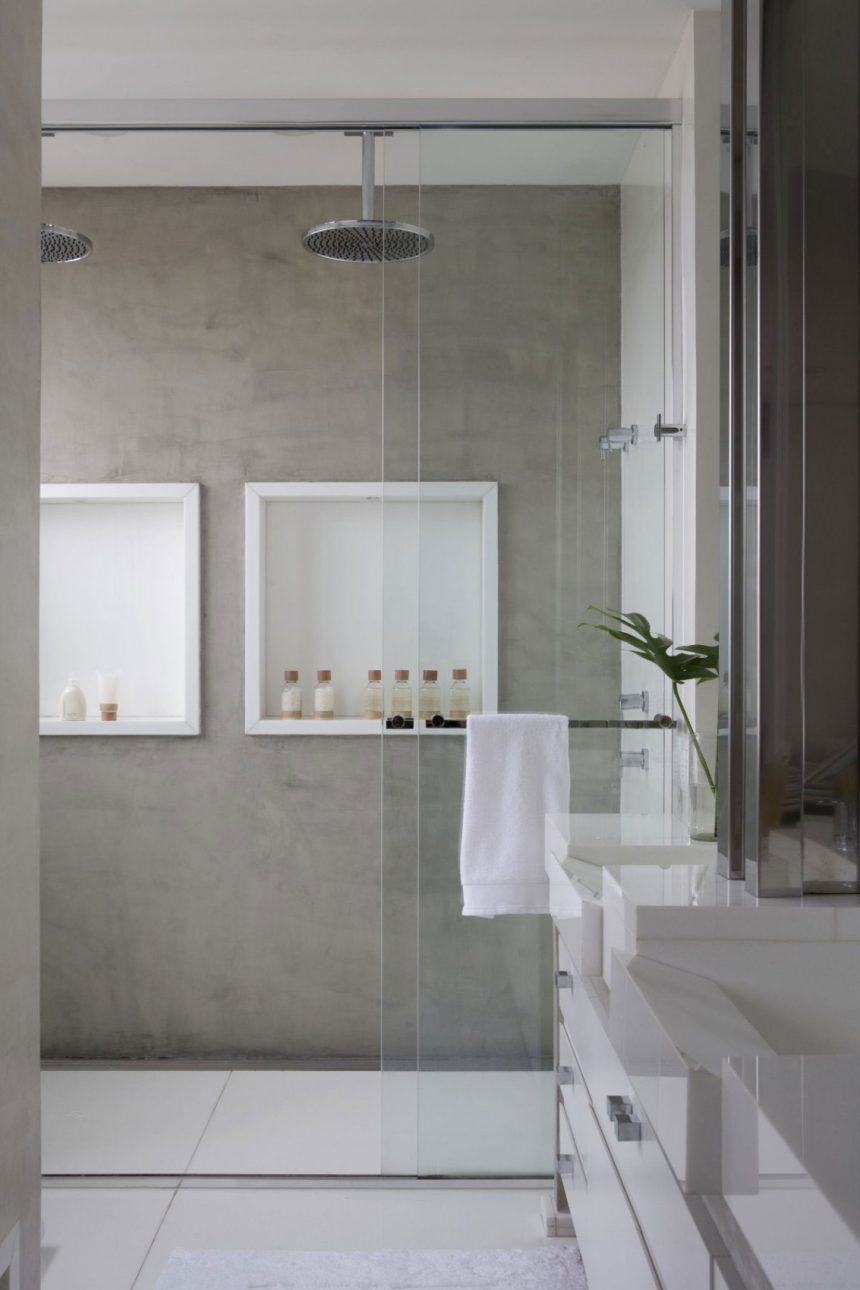
In spite of their permanence, shower niches are not the type of feature you’d want to replace often anyway and that almost always makes them desirable in the bathroom. Wondering what a shower niche could do for you? Its usefulness is not entirely related to the idea of storage. A niche is practical in more than one way. From an aesthetic point of view, it looks simple, stylish and versatile. Add to that all the customization possibilities and you’ll fall in love with the concept.
We’ll start off by saying that a shower niche is actually a pretty broad concept. Think of this more in terms of a bathroom niche which looks great in the shower but can also be practical elsewhere in the room, like this long one which fits elegantly above the ink and toilet. It’s the work of Ardesia Design for a home in London.
This bathroom renovated by ONG&ONG in Singapore has a shower niche placed low on the wall, just a few inches above the floor. It looks like a practical design both because it’s low enough for everyone to reach it (both kids and adults) and because at that level it’s improbable to knock over the items by mistake.
 View in gallery
A lot of times shower niches are designed to blend in and to disappear into the wall but that’s not the strategy used by Fábio Galeazzo for the Urban Forest project in São Paulo, Brazil. These niches stand out by contrasting with the wall around them.
 View in gallery
The residence designed by Remy Meijers has its own style of shower niches. The fact that the bathroom has this corner nook already makes the space feel small so the designers tried to keep everything as simple and as open as possible, hence the niche that blends in and its transparent glass shelves.
 View in gallery
A corner niche, just like.a corner shelf, is practical because it takes advantage of an otherwise unused space. This design strategy is particularly useful when dealing with a small space like this shower unit created by Perianth Interior Design for an extension of an old house in New York.
 View in gallery
Sometimes a shower niche can stand out and other times it can look very natural, like this one created for the Box House by 1:1 arquitetura:design. The niche has the exact same length as the window so it almost looks as if there are two openings in the wall.
 View in gallery
If you want the niche to double as an architectural feature and as an eye-catching decor element, a common strategy is to use tiles in a different color or style than those used for the rest of the walls. The white and blue combo used here by Ibarra Rosano Design Architects is a great example.
 View in gallery
Vertical niches can emphasize the height of a space which is useful not only when you’re dealing with a small bathroom but which small enclosed spaces such as shower units. Check out this design by a_collective created for modern residence in Singapore.
 View in gallery
Speaking of small bathrooms, there’s one that’s been renovated by Paul K Stewart, part of a home in Toronto. In spite of its limited floor area, the bathroom looks surprisingly open and airy. It’s all thanks to design details such as the floating vanity, the light color palette, crisp contrasts and the overall minimalism which includes features such as long and narrow window and the small niches in the shower.
 View in gallery
A similar design strategy was used by architect Sarah Waller when designing her home. Notice a few addition features such as the accent LED light strip under the vanity, the placement of the shower niches, the touch of green and the minimalist glass divider.
 View in gallery
There’s something poetic about this small walk-in shower. It’s partly because of the black frame and the way it contrasts with the white subway tiles but also because of that small, square window and the built-in storage niche placed above the bench.
 View in gallery
Featuring white as the primary color with black accents and golden details, this small bathroom is a perfect blend of traditional and modern with just a hint of classic beauty. Once again, the shower niche is an important part of the design.
 View in gallery
Studio Post Architecture did an excellent job at updating this old residence in Toronto. The bathroom is exceptionally clean and beautiful. It has this slick niche which links two adjacent walls and is highlighted by light strips. It given the space a futuristic and sophisticated look.
 View in gallery
A trio of shower niches is the element that brings symmetry to this bathroom designed by Patricia Salles. The residence as a whole is luxurious and elegant. The bathroom itself is pretty spacious, featuring a generous walk-in shower with tiles that resemble stone both in terms of texture and color.
 View in gallery
Think of a shower niche as a space-saving alternative to wall-mounted shelves. It offers storage without making the space feel unnecessarily small by taking up space. Niches are embedded into the wall like this one designed by the Cliff House by architect Scott Allen.
 View in gallery
Tubs and niches also go well together. In fact, a niche built into the wall can offer a practical and more stylish alternative for all those things we usually store on the corners of the tub. It’s a way of maintaining a clean and organized bathroom.
 View in gallery
We really like this tub and shower combo planned by Minosa Design. It really looks like they’re a single space and that’s thanks to the transparent glass divider between them. In addition, the design is continuous and very well balanced on both sides, with wall niches that maintain a simple look.
 View in gallery
What can we say about this shower designed by Jennifer Bunsa other than it looks really cozy and inviting. It has wood on the floor and the walls and ceiling are decorated with tiles in two different pattern. The shower niche matches the ceiling and this allows it to stand out without looking out of place.
 View in gallery
The entire bathroom designed by Double G. Cautious is defined by a two-toned look. We love how the walls are mainly simple and monochromatic and how patterned tiles are used in key areas and for features such as the shower niche or the storage area.
 View in gallery
Simplicity is sometimes the best design strategy, especially when there’s more than one direction you could follow. Take the bathroom of this townhouse for example. It could have been designed with robust beams on the ceiling like the rest of the rooms but instead it was left simple, with white tiles on its walls, floor and ceiling and with space-efficient storage options like the shower niches.
 View in gallery
Even though it’s easier to build and design a square or rectangular shower niche, that doesn’t mean no other options are available. Tirmizi Campbell gave this bathroom a set of circular niches. They look really beautiful and they coordinate well with the fixtures.


